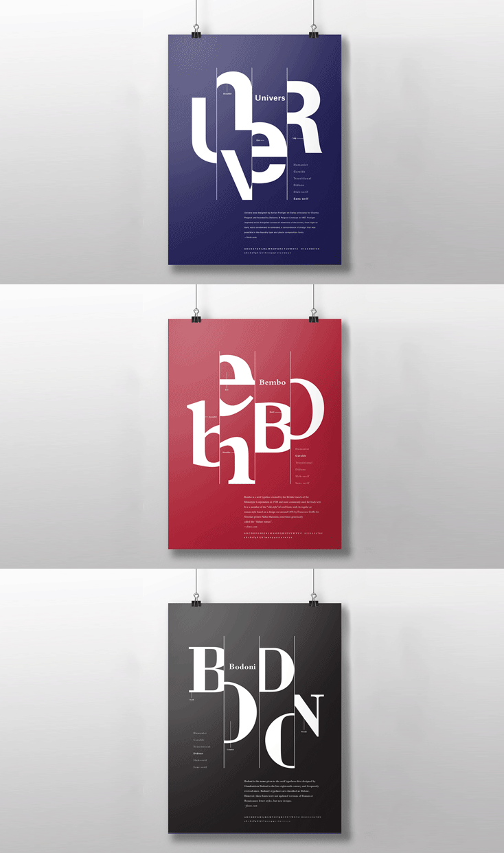
Constructing Simplicity
Objective Choose a famous artist and design a Logomark, magazine, catalog, and poster about their work to make an art exhibition about them. The goal of this project is to show the ability to create a system for all deliverables. The design challenge is to show typographic skills in a highly flexible design system that fits the needs of the art exhibition. Approach I chose a Singaporean architect, Soo K. Chan, to develop the art exhibition project. He is known for his clean and contemporary look. A consistent scheme, consistent typefaces, and graphic elements are applied to all deliverables. I chose a sans serif typeface and simple graphic elements to emphasize the contemporary and bold just like Soo K. Chan’s work. The use of gold and brown colors represents his trademark color scheme.

